Alert: Canvas Outage Update
Canvas access has been restored for our users, but the service reliability remains uncertain. Due to recent events, Canvas has had intermittent outages which are at the discretion of the vendor and may occur during a final exam. Faculty and staff may continue to use Canvas, but we strongly advise faculty and students to prepare a contingency plan for turning in assignments and final exams in the event Canvas access becomes unavailable again.
Instructure, the company that owns Canvas, has provided an FAQ about the incident, which may not answer all your questions. We will share more information if it becomes available.
Instructure, the company that owns Canvas, has provided an FAQ about the incident, which may not answer all your questions. We will share more information if it becomes available.
Learn More
CTA widget
About
Need a simple, clickable button that is featured on multiple pages? The CTA widget is just like the call to action widget with some added features. This widget is perfect for encouraging users to take an online action, like "sign up," "register," "donate" or "learn more." This is especially true for buttons that reoccur on different pages as you can create and manage the content for this button in one centralized location (i.e. the Content tab in the dashboard). Another perk to using this widget over the traditional call to action widget is that buttons can be scheduled to publish or unpublish in advance. This allows CTAs to appear for application deadlines or events and disappear when they are no longer needed.
 NOTE: This is a reusable content type widget, which means it is dependent
upon content you've first created as a content type from the dashboard menu.
Design
Dual themed colors
Additional color options
Every theme in Sitefinity has three theme specific colors to choose from. They have been predetermined to fit well within your theme design. Furthermore, you can choose to use the additional color variations below in this widget to further customize your design. To choose your colors, select them under the card display dropdown menu when creating the CTA button in the "Content" area of the dashboard.
| Color name | Color Example |
| White text, black background | Sample |
| White text, dark grey background | Sample |
| Gold text, black background | Sample |
| Black text, light grey background | Sample |
| Black text, grey background | Sample |
| Black text, light gold background | Sample |
| Black text, gold background | Sample |
| Black text, dark gold background | Sample |
How to
Create a CTA
The first thing to do for this widget is to create the content. To do this, go to the dashboard and select the Content tab at the top. Then select "CTA".

Click "Create a CTA" and fill out the required information for the button text, link destination, and the button and font size (you'll need to expand each section). You can also choose a color under Button Display. Publish when finished.

Use the widget
Once the CTA button content is created, go to the page that the widget will be displayed on. Drag the CTA widget from the right column onto the page.

Choose Edit to select the proper button(s) to display under the "Content" tab.

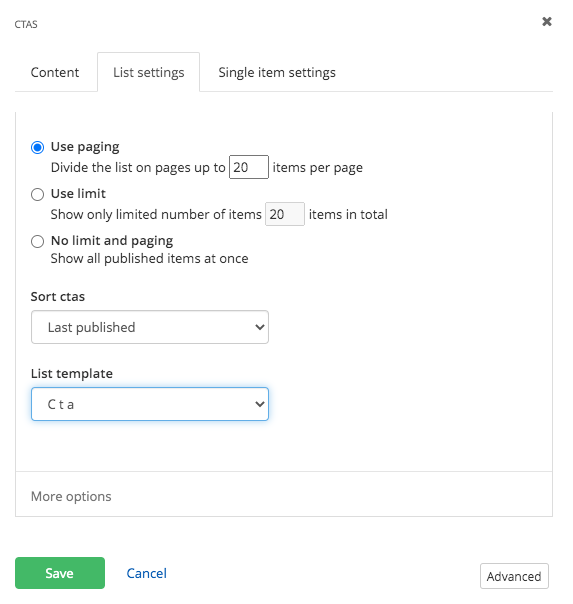
Under the "List settings" tab, choose limitations, sort options and colors.
You can choose the colors of your CTAs under "List Template". You will have the option to select from three predetermined theme colors (cta, cta secondary and cta tertiary). If you chose a different button color in the CTA properties in the "Content" area, you can display that color by selecting "cta inherit colors".

No changes need to be made in the "Single Item Settings" tab. Save.

Additional Information
Accessibility Requirements
To make your button accessible for all site visitors, be descriptive and concise with button labels. For example, instead of using "Learn More" in regards to admission requirements, try using "Learn More About Admissions".
Link Destination Indicators
Two button icons are available in this widget so you indicate link destinations:
![]() an external site
an external site
 a password protected page. (please note: this overrides external site if both options are checked)
Tips
• CTA is a short name for a call to action.
• Use CTAs to direct users to key pages of your site that align with measurable initiatives of your department.
• Be sure to only have one link per CTA button.
• Check out this page, if you would like to manually sort your CTAs.