Digital Style Guide
Guidelines
Below are details around page elements and default styling for widgets within the CU Denver Sitefinity ecosystem.
Page Layout:
Navigation & Layout
Homepages & Main Landing pages (All)
This is the top page of your site. These pages are meant to provide an overview and give users a way to dive into the site. Because they are the highest level of the site, they should not include side navigation as top-level navigation should be enough to get the user started. Because these pages don't feature side navigation, the content should extend all the way across the page.
Sub-landing & child pages
These pages help to direct the user to certain content within a previously selected area. For that reason, they should include side navigation to help the user quickly find what they are looking for. To accommodate side navigation, these pages use Sitefinity's default 3+9 grid but include padding between the side nav and the content column to create more visual separation. See the padding section below for more details.
Side Navigation
Overall side navigation is set up on the system level for Sitefinity pages for consistency between sites. There are however some options for how it is displayed on a page using the "Titles & Properties" options for a page. For all pages on the CU Denver main site, the following specs are what was used to provide a consistent experience. We highly recommend you also use these settings for a more consistent experience between sites.
Sidebars
Sidebars are the thin vertical columns to the right or left of the main content column. Sidebars typically contain side navigation as well as cross-links and other important information. When adding content to either sidebar, the content must remain simple and uniform across your site. This is information you want to push to the top of your page for timeliness or awareness purposes. Do not add custom visual elements as they distract from the content. In such a small space the content alone along with a possible CTA is all you should need. We recommend that pages never have both a left and right sidebar at the same time. When using sidebars please pay extra attention to how the format in mobile.
Left Sidebar content
The top of the left sidebar is reserved for side navigation. If side navigation is turned off, best practice suggests that you should not use a left sidebar. Any content added to this sidebar should be located under the side navigation. The information shown in the sidebar is most often used for crosslinking and key date/awareness information. This is an important part of your page's SEO strategy and should have a consistent location on every page.
Right Sidebar content
As of now, we are not using the right sidebar.
Padding (Breathing/White Space)
When laying out your page, be conscious about the spacing between the different elements and sections on your page. By adding space between elements and sections you are helping a user visually "group " pieces of information and "breathe" when consuming information as they work their way through your page. It's important that the user doesn't become overwhelmed and leave your page.
All Sitefinity pages are based on a 12 column grid system. Various layouts within that grid can be found on the Layout option within the edit page function. (located in the top right of the page) This function will allow you to make layout adjustments to your page. Whichever layout you choose, make sure you stay consistent throughout your site. Sitefinity's default grid layout is grid-3+9 layout. CU Denver's grid layout is based on that grid.
Within the grid-3+9 layout, we added padding to the pages to create a more spacious look by adding various Bootstrap clas elements outlined below.
Page Grid: grid-3+9
Page: Row padding (from top nav/hero image): row pt-4
Page: Column 1 Padding (sidebar horizontal padding): bootstrap_4 col-lg-3 pr-lg-5
Page: Column 2 Padding (main content column padding): bootstrap_4 col-lg-9 pt-5 pt-lg-2
Main Content Grid: grid-12 (Initial layout - grid then varies based on content)
Row Padding: row pb-3 pb-lg-5
Column Padding: bootstrap_4 col-lg-12
Within Content: Padding between sections of information: 50px
Bootstrap settings:
Row Padding: row py-lg-4
Column Padding: bootstrap_4 col-lg-12
Within Content: Padidng between elements within a section:
Row Padding:
Column Padding:
Horizontal Rules
Horizontal rules are a good way to separate pieces or sections of content giving users eye a clean break in content helping them "reset". When photos and other visual elements aren't applicable, rules help create the visual separation needed for proper information organization. These should be used sparingly throughout a page to avoid any "striping" effect.
Page Elements:
Typography
Sitefinity's default font is Helvetica Neue. The exception within the typography hierarchy is that paragraph text which is Arial. H Tags are the best way to set up your typographic hierarchy throughout your site. Below is the hierarchy used on CU Denver's main site.
Page title in the content area:
H1 Thin: 34px - 45 Light
Page subhead in the content area:
paragraph - 5: 18px - Arial
Section titles in the content area:
H2 Thin: 28px - 45 Light
Sub - Section titles in the content area:
H3 Regular: 22px
Rest of the H Tags:
H4 Bold - 16px
H5 Bold - 14px
H6 Bold - 12px
Body Text:
Paragraph - Arial 14px
Photography
The photography used on our sites help bring our pages and brand to life. The photos used throughout our sites should be the best representations of our content, people, community and campus. Below are some guidelines to use when choosing the photography for your site.
Tone & Style
Interactions: Capture and showcase how our campus connects people, places and the community.
- Show collaboration with others when possible
- Authentic interactions (not posed or forced)
- Displaying positive/natural emotion
- Engaged with others or in what they are doing


Composition
Keep things simple and engaging.
- Photos should have a singular focus
- The focus should fall within the middle third of the photo (this assures proper cropping for screen cropping flexibility)
- Backgrounds should be simple
- Try to mix group and single-subject shots
- Highlight the campus environment


Subject:
Use real students, faculty and staff to portray authenticity and connection with the individuals that make up our CU Denver community.
- Show faces whenever possible to highlight emotion and human connection
- Photos can show social gatherings around campus
- Highlight education experience
- Student & teacher
- Students working together
- Faculty teaching
- Be sure subjects present themselves in a professional manner - Hair, apparel and items within photo should not appear messy and should be appropriate to represent the university
- Avoid using images where the subject looks posed


Lighting & Color:
Create a vibrant and energetic feel that captures the energy flowing through our campus and people.
- Lighting should always appear natural
- Avoid harsh highlights or shadows, particularly on faces
- When possible photos should have vibrant colors
- Color balance should be corrected on all photos
- No hot spots or neon tones
- Effects like motion photography for added energy should be used sparingly
- Lighting and color should enhance the focus not detract from it


Locations:
Align locations with content capturing the campus and community environment.
- Showcase areas around campus
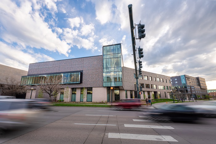
- Exterior shots
- Location to the City
- Interior social gatherings
- Classroom/lab experiences
- Avoid easily recognizable settings off-campus (ie: sign of union station in background)


Photography Sizing & Optimization
We get a lot of questions about how to use images on the web. What size they should be? What dimensions? We have a few general recommendations and some tools to help you out! See links below for image size guidelines and optimization guidelines.
Iconography
We use the Pro version of Font Awesome for our icons in Sitefinity. Some widgets use previously defined icons to identify user experiences throughout our pages. Widget s like the side navigation, CTAs, and related links are a couple of these widgets. Other widgets, like the featured tabs widget, include the option to add an icon for a more visual effect.
Those who would like to use icons on a page, can also do so by embedding HTML code directly from font awesome into a content block. To learn more go to the @web link below:
Learn How to Use Icons
Color
When deciding how and when to use color, consistency is key. When used strategically, color can help groups like pieces of content, highlight the main messages on a page, or help direct users down a certain path. See the examples below of when and where we strategically used color in our CTA buttons and content cards. Do not use custom colors– only gold, black, and white (with gray outline) are allowed.
Overall color approach:
Highlight: Gold
CU Denver's gold is a great highlight color on a webpage. When used for backgrounds on CTAs and widgets such as the "Fact and Stats" widget allow that information to jump off the page and commands attention from the user. Use sparingly to create a hierarchy among your content and to draw users to the top 2-3 pieces of information on your page.
Important: Black
Black creates a strong contrast against the white background of the page making it a good color to draw a user's eye toward certain elements. When used in excess black can make your page feel heavy and dense but if strategically placed, it can help direct a user's eyes through your information.
Secondary information: Whites and Grays
Whites, grays, and outline graphics are a good way to group information and to define different elements. Use these colors to help organize your information and various widgets throughout the pages. These colors are best to implement on your secondary and tertiary information.
Page Construction:
Below are some basic rules we have established to help promote consistency and a better user experience across our site:
- Only 2-3 gold elements on a page - we really want to use gold to highlight the key information /CTAs on the page
- CTAs
- Single-small setting and width is based on text
- multiple-small setting with equal width settings
- Don’t stack multiple widgets with differing columns - this is due to the various padding built into each widget creating misalignments which can look sloppy
- For initial reviews, pages will feature placeholder photos and enhanced cards will all have white backgrounds. If the pages need more visual elements we can then go back in to add background photos
- For sidebar call outs - Try to limit to one
- No right sidebar option due to mobile issues